College project for Corporate Design 2
Animal Alliance

They are an NGO that is dedicated to reforming Ontario’s Animal for Research Act and advocates for stronger laws and protections for domesticated and mistreated animals.
Their core belief is that all animals deserve to live free from cruelty and exploitation, it is their moral responsibility to protect them through advocacy, education and legislative change.
Who is Animal Alliance?
The Issues with the Brand
All of the publications on social media are not unique nor cohesive. They lack design elements that align their posts with their brand, even the use of the logo variations.
01.Lack of unity
The tone used should always be the same, no matter the topic. However, the current copy lacks this.
02.Tone of Communication
03.Use of the Logo
The green version is the principal one; however, the black version is what is commonly used across social media.
There are too many elements in the logo, which is chaotic, hard to see and understand at first glance. It also has poor legibility and is imbalanced.
There are no secondary colours used, narrowing the colour palette. In addition, they do not use this colour anywhere else, only in the logo.
04.Logo and Colour
They use too many fonts throughout their posts and designs. They also do not create it based on the recommended ratio, causing some posts to appear cropped. This made their feed look noncohesive and imbalanced, creating a lack of unity across their social media.
05.Layout & Typography

Brand Atributes
Warm and personable. Creates a sense of trust and comfort with the audience.
Friendly
Honest and heartfelt. Cares genuinely about its customers and causes. Transparent in communication.
Sincere
Strong visual identity, opinionated messaging and takes clear stances on important issues.
Bold
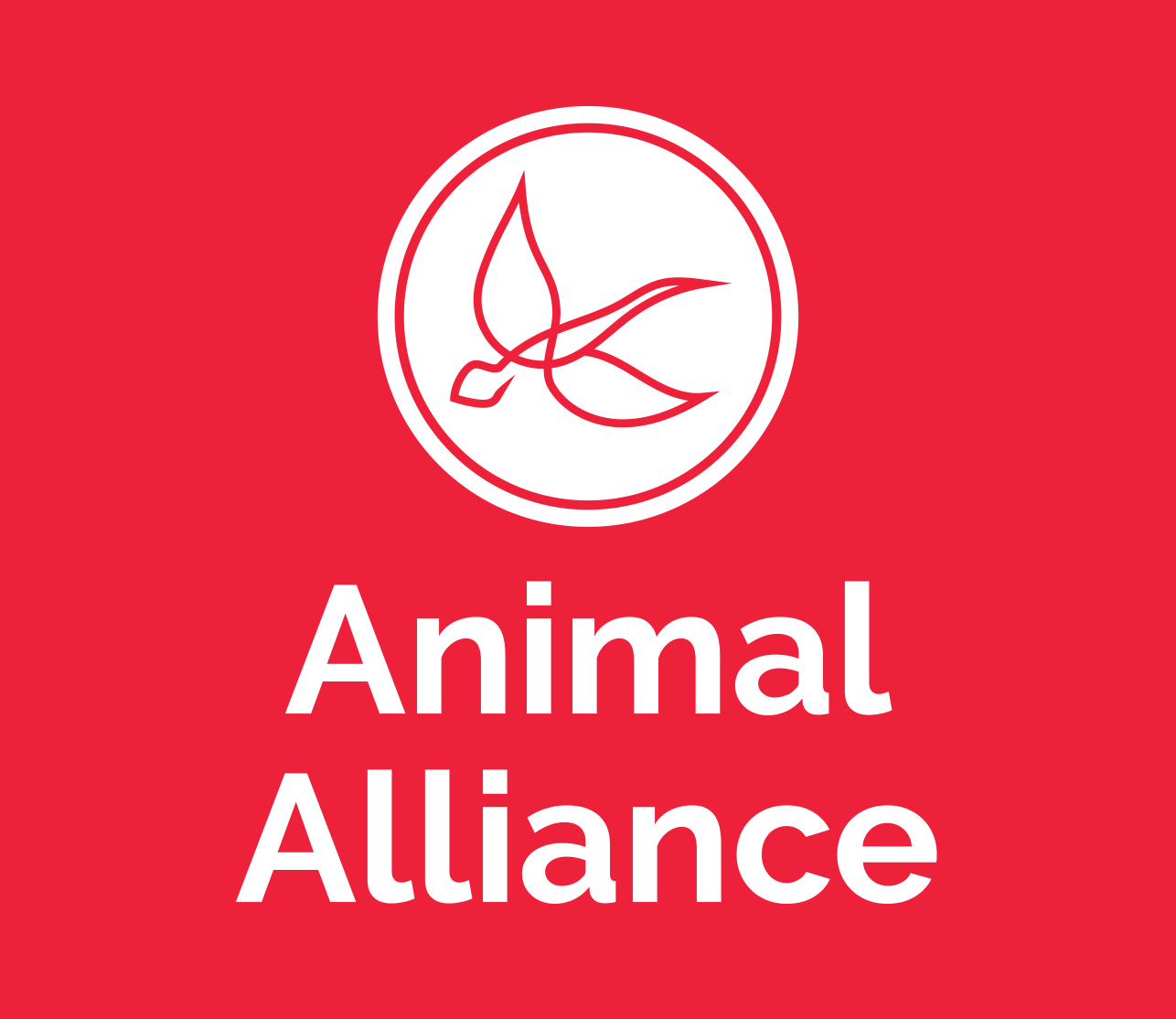
New Logo
Brandmark Analysis:
A circular shape with a ring evokes unity and protection, while representing a community gathering for a cause.
Shape


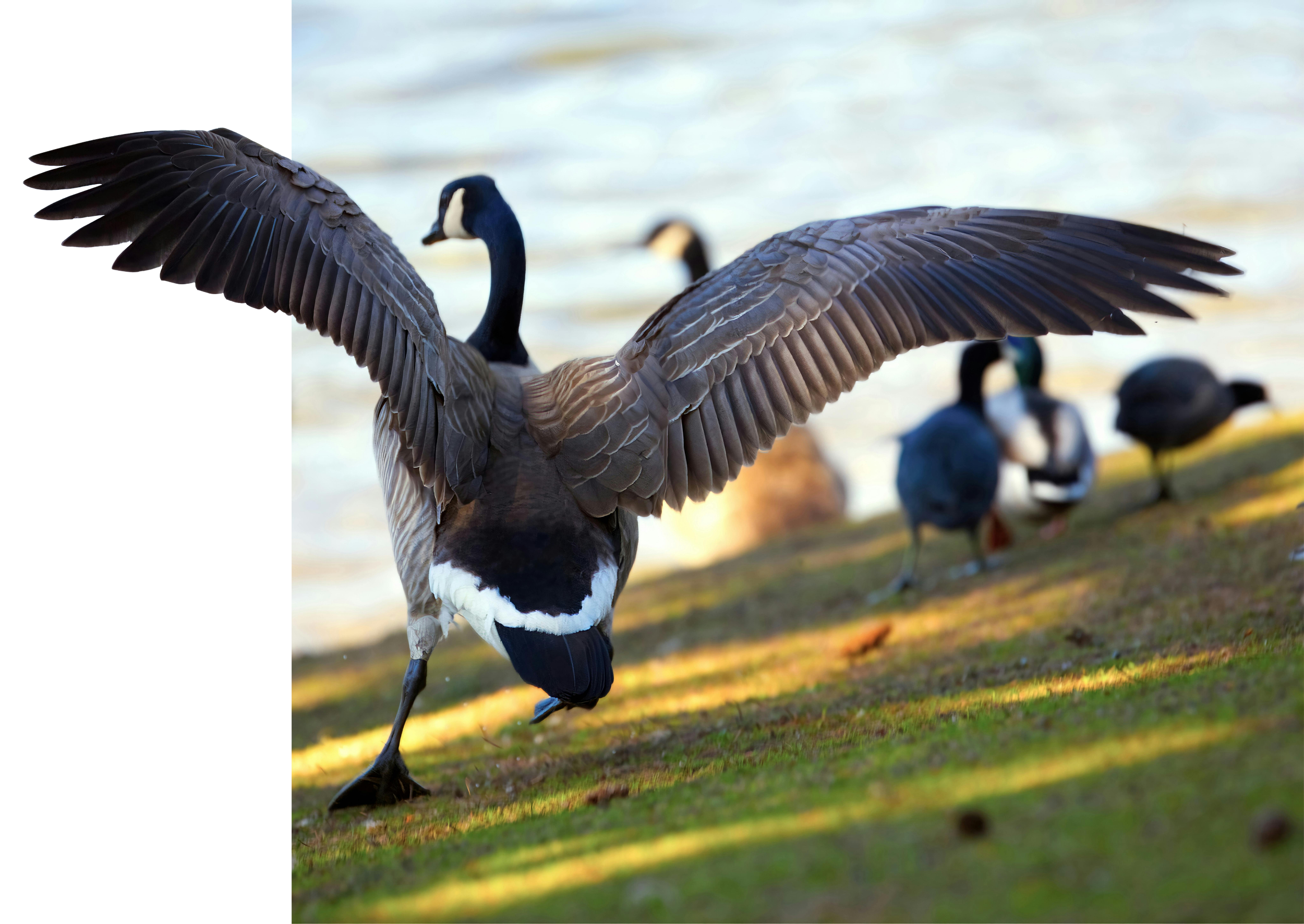
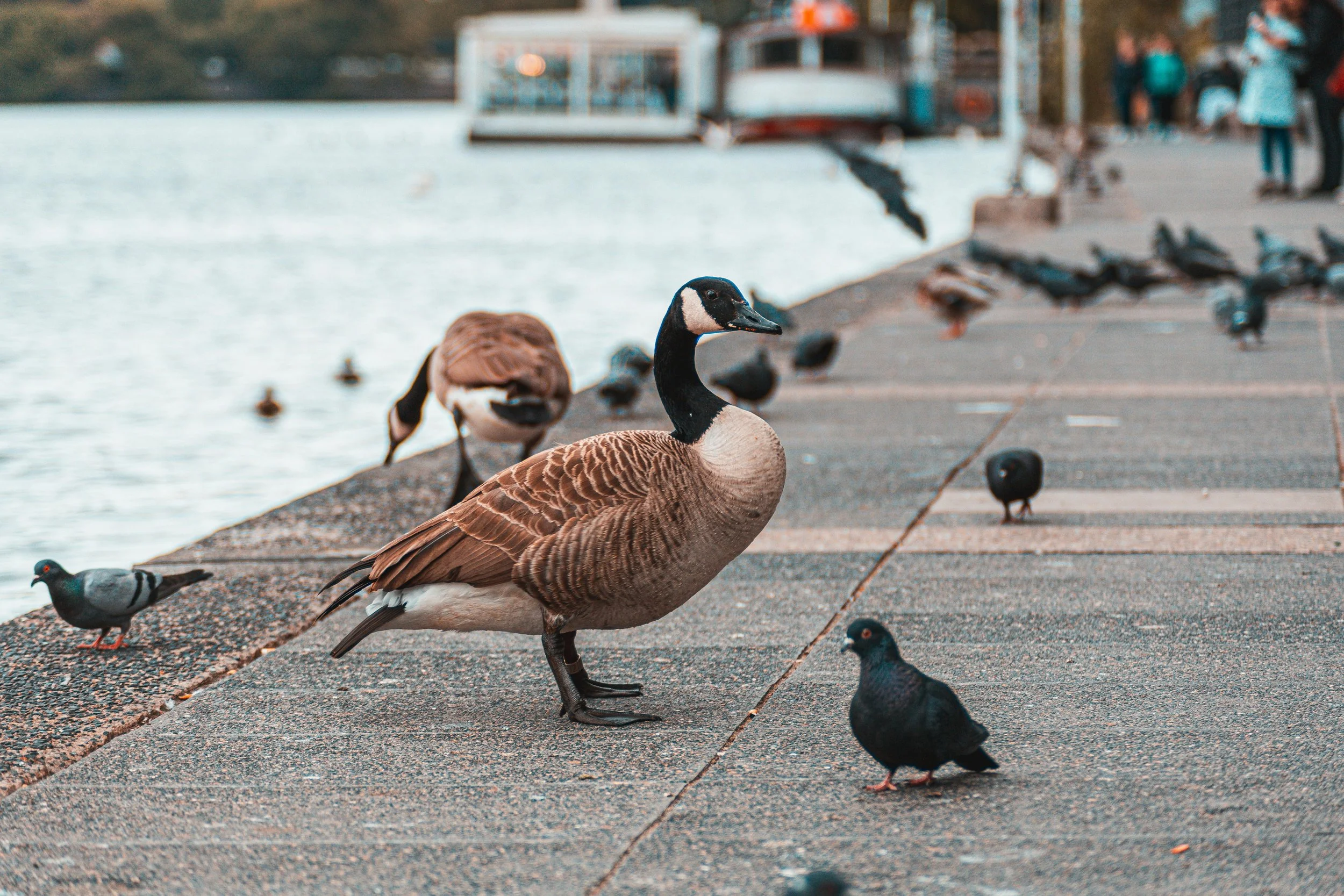
The Canadian Goose is one of Canada’s protected animals, used to represent
the country and the message: We should protect all animals, just like how we protect the Canadian Goose.
Symbol
Typography

Raleway is a Sans-Serif font with different weights. It's modern, conveys clarity and ethics, which work well to express the brand’s friendliness while still exhibiting professional activism, balancing warmth and authority.
Raleway
Colour
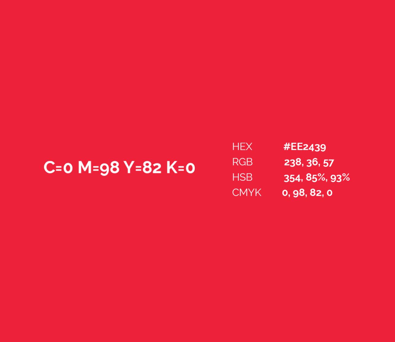
The red represents action and love for the animals, and the white conveys transparency and ethics. The combination of both expresses energy and purity relating to activism and compassion.
Red & white
Variants of the Logo
Position of Brandname
The rule of three was used to create balance between the brandmark and the name.